What Does Good User Experience Actually Mean and What Does it Look Like on a Website?

User experience design is a wonderful combination of design and psychology. Why people do the things they do is studied and forms user experience principles. Designers use this knowledge to create smooth experiences. Applying UX (user experience) design to websites helps convert visitors into customers.

Your website is only a part of your whole customer journey, but it is one of the most important because this is where you are often making your first impression and where you’re selling your product or service. Your website is a major decision point for your visitors. A negative experience can cause them to leave and never consider your business again. While a positive experience means they’re much more likely to convert into a paying customer.
But what contributes to a good or bad website experience?

It’s proven that an overwhelming number of options leads to indecision. On a website this is too many things like buttons, pops ups & visual clutter causing a visitor to leave the website altogether! So, what a UX designer does in this case is ensure that there are only key options available, the ones that are the most important (like leading a website visitor to make a purchase). If there is any aspect of your website that you have left for the visitor to decide, make sure it is for good reason. If an action can happen automatically without an added decision on the visitor’s part, do it!

Remove unnecessary options to avoid decision overwhelm. Add clarity and context to avoid confusion.

In the case of mobile responsiveness, we look at adjustments that are needed between larger and smaller devices. Such as button sizes, layout, text readability, and colour contrast. We make these adjustments to ensure your visitors aren’t being put off by anything. Common website issues on mobile include text that’s hard to read, buttons that are too small, important content being cropped off, and large unintended gaps. Designing your website for mobile as well as desktop is essential. The smoother the entire customer journey is, the better for your business.

Let’s take a look at a couple of common bad user experience mistakes on websites.

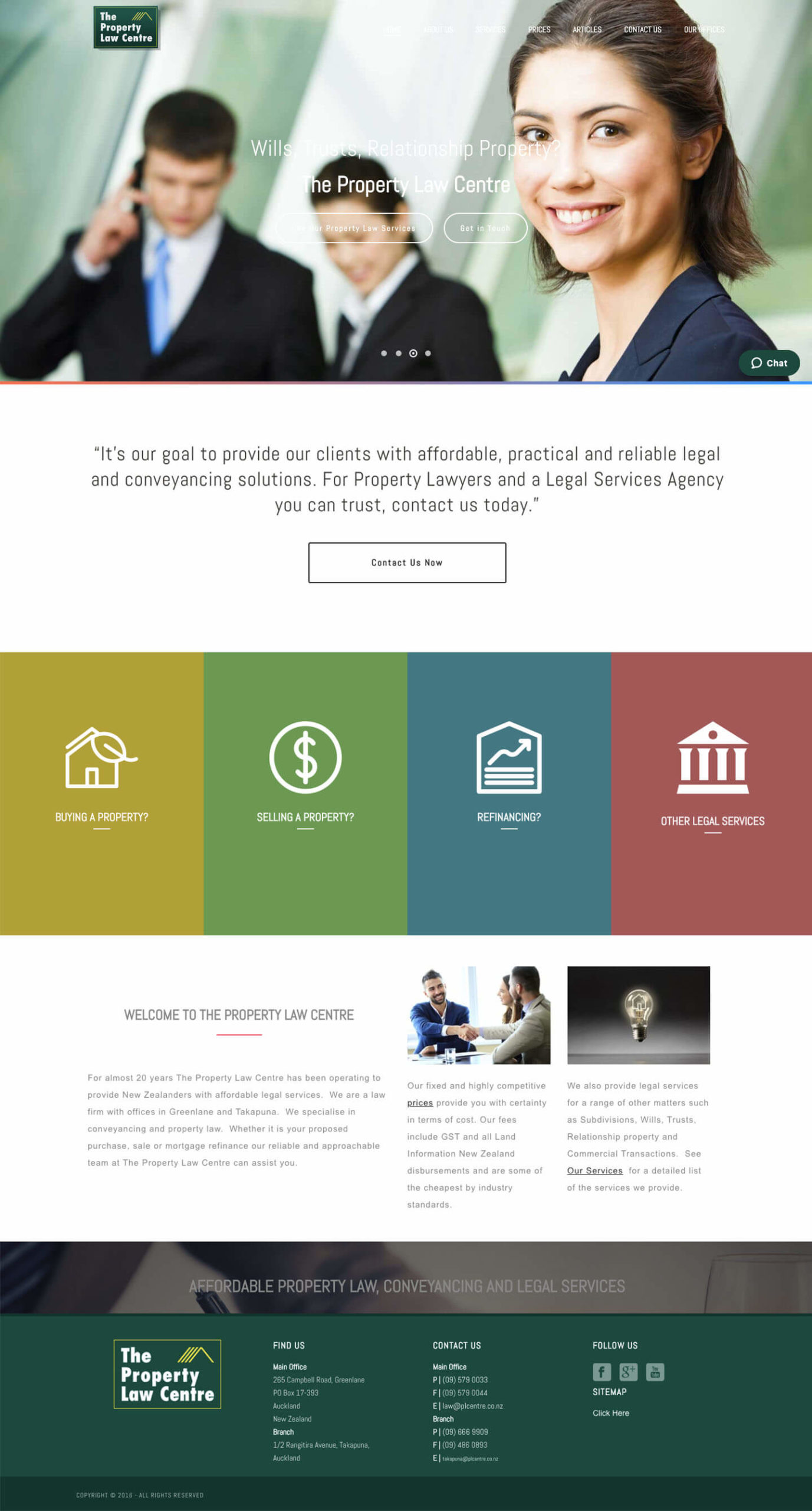
There are two key mistakes on this website. Both negatively effect the user experience. Can you spot them?

Click on the buttons below when you’re ready to read the answers.

  • UX mistake #1

    Poor Readability

    What’s the problem?

    On this website the navigational menu, main banner’s text & buttons, and the text banner above the footer are all difficult or impossible to read. This is because they have used similar (or the same) colours on top of each other, poorly effecting their visibility and therefore readability.

    Why is it bad?

    If visitors struggle to read the information on a website, they are likely to leave. A competing business will have readable information on their website. It’s easier to close this website and click on the next search result on Google than it is to decipher unreadable text. This loses the business a potential client who they could have helped.

    How do we fix it?

    This website could improve its user experience by increasing the contrast between the text colour and the background colour. A simple colour change is all it takes to provide readable information to visitors. Don’t forget that every website visitor is a potential client or customer, make it easy on them.

  • UX mistake #2

    Stock Images

    What’s the problem?

    This website uses run of the mill stock images. They’re not unique and they scream inauthentic. It may be easier to use stock images from the internet than to take your own photos, but it is not a smart decision. We humans can naturally detect what isn’t real.

    Why is it bad?

    Using stock images like this causes a bad user experience because they are an instant turn off. It gives off a cold feeling. This very well may be the first time a visitor has come across your brand – would you rather leave them with a cold or warm first impression?

    How do we fix it?

    We want to give visitors to our website a warm welcome. This website will improve its user experience by using authentic images taken of their own team. Use images you or a photographer has taken of your team and space. Your own images tell your story best. Show off who you are and what you stand for!

This is the same company’s website today, redesigned by Ashleigh here at Glow Creative.

Although more went into this redesign than fixing those two mistakes, you can see what a fantastic improvement it has made to have clear information and personalised photographs.

Visitors are no longer battling with barriers to get the information they need and they’re being given a good impression of the company.

What does good user experience look like? A visitor fully engaging with and enjoying a website without having to question it (good design feels natural & easy to the person using it).